Did you ever have a design plan for a room and found out that it looked better in your head, than it did in real life?
Well, I'm kind of in that place, right now.
And I have been for over a year.
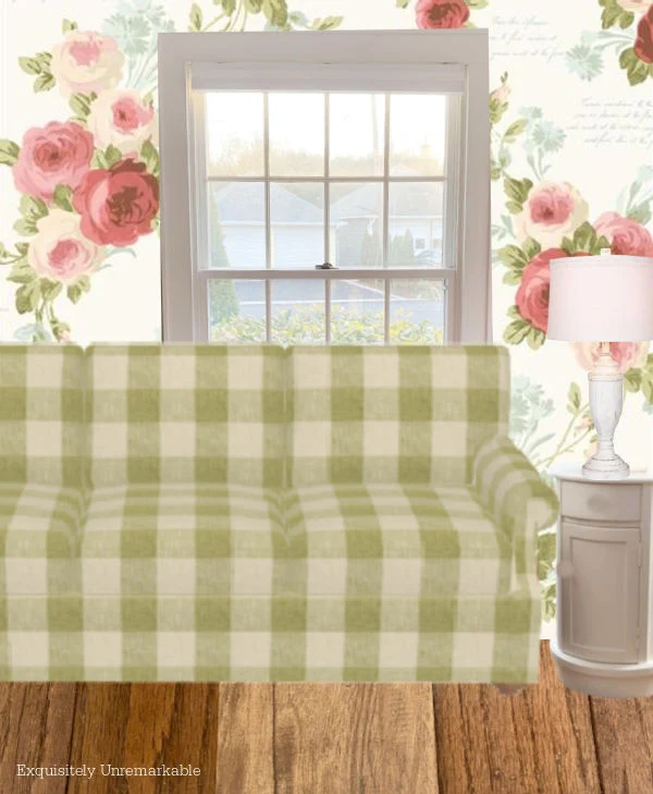
Oh, don't get me wrong.
I adore the sofa.
The fabric and style are both gorgeous and durable. That couch is so comfortable, I fall asleep on it almost every night.
It's literally a dream.
So clearly, not the couch.
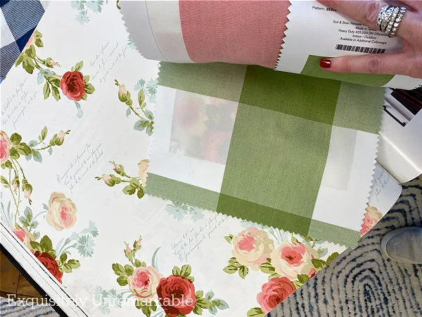
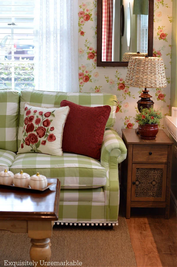
Those colorful roses, brighten up the space and add the perfect amount of cottage charm.
It's what ties that room to the rest of the house.
And the adjoining kitchen.
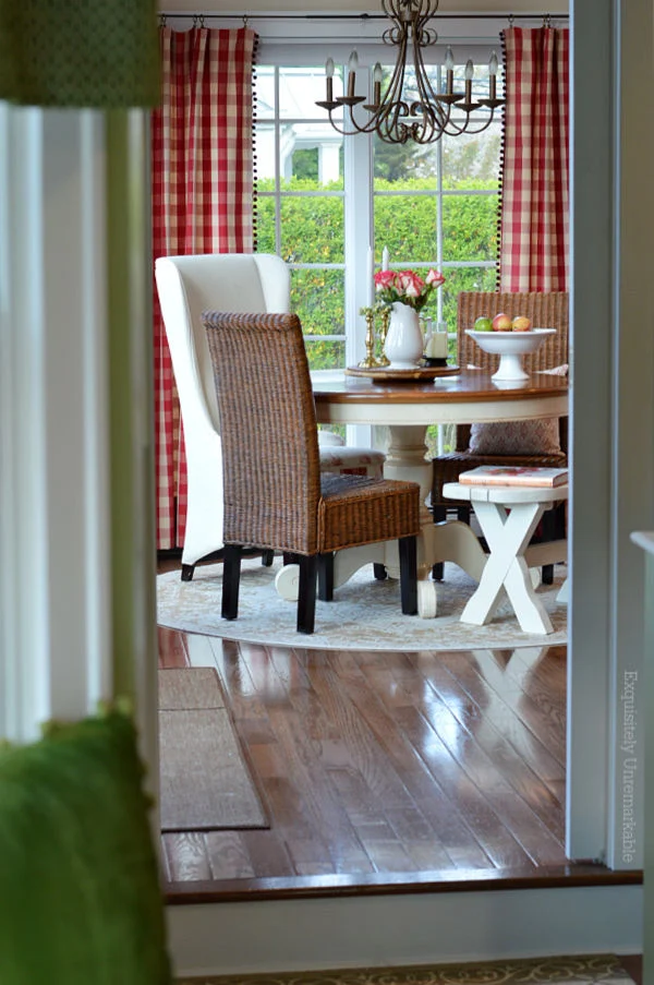
It's certainly not the green paint either.
Green is - believe it or not - my favorite color.
It's a lovely shade and frames my window seat and makes all the bright, white trim pop.
So what's the problem.
I don't know.
I just know that all together something feels off.
Oh, on paper, the combination of all the elements looked ideal.
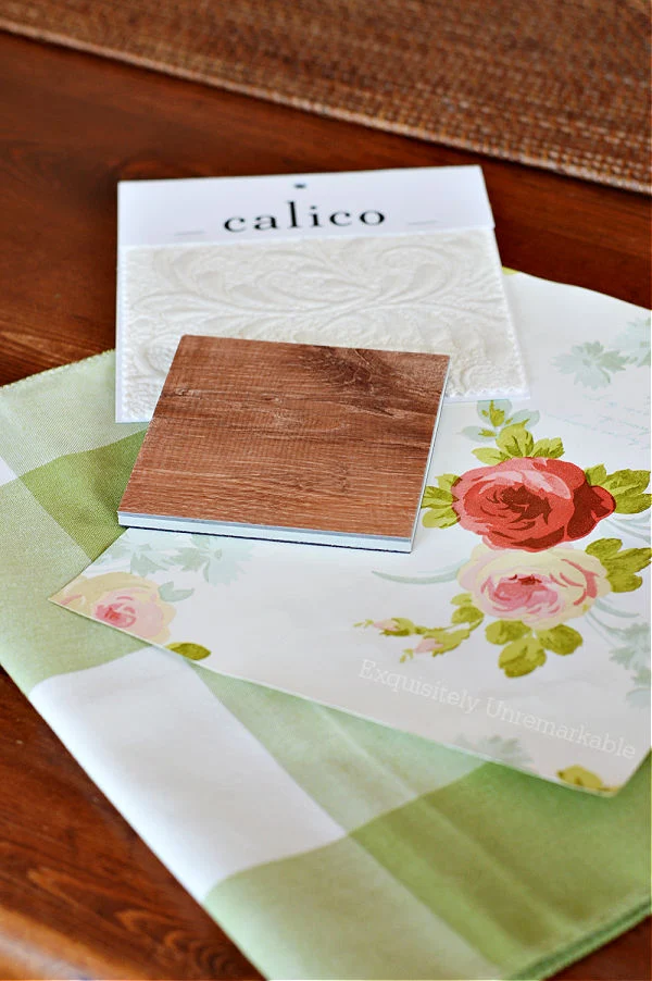
Swoonworthy, in fact.
I couldn't wait to get everything set up.
Especially since we'd been living in renovation for so long.
However, once the big pieces were in the room, I struggled to make it feel...cohesive?
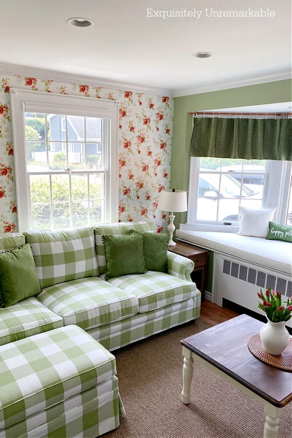
I can't explain it. I just know then whenever I looked into that room, it felt off.
So, being the DIY problem solver that I am, I started swapping things in and out, in an effort to bring everything together.
I moved tables.
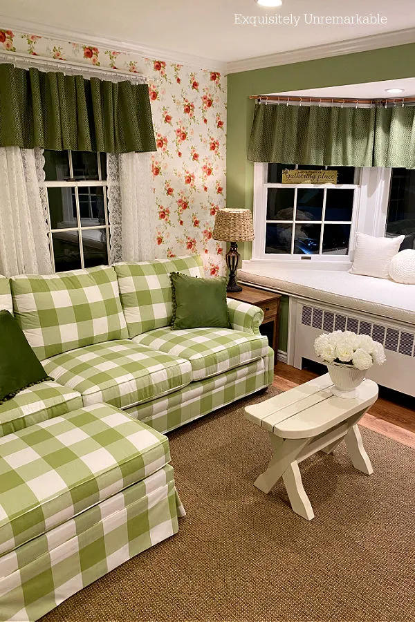
I tried white ones.
And red ones.

Wooden ones.
And skirted ones.
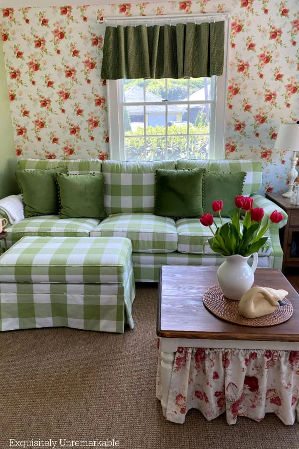
I made patterned curtains.
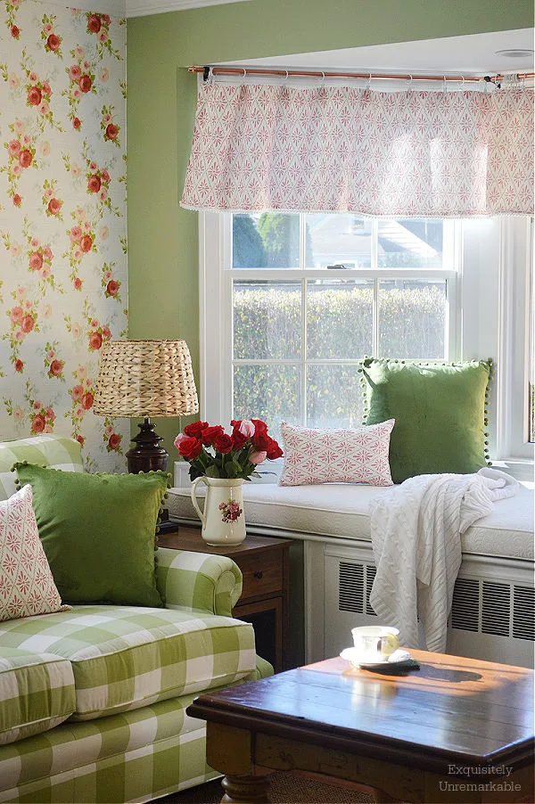
And solid ones.
I added lace panels.
And took them away.

I bought green pom pom pillows.
And moved floral ones from the living room in here.
And then put them back.
I added mirrors and wire shelves and blinds.
Which all helped a little but the room still didn't feel...right?

I even went back to an old post about subtracting elements from a room, and took my own advice.
I pulled everything out except the basics.
Just green and white, with one red flower pot to tie the wallpaper into the room.
Honestly though, I'm still in a state of flux...stuck somewhere between too much red and/ or green and too little.

She keeps trying, I guess. I'm certainly not ready to throw in the towel. As I said, I absolutely adore each element in the space.
One of these days I think I'll hit the nail on the head and find myself saying Ahhhh whenever I walk past that room...instead of Hmmmm.
For now, however, I thought I'd ask for your opinion, all of you very talented home decor enthusiasts.
Because I'm tired of being on the ropes.
I'd really love it if my original decorating plan and my reality could finally become one.
At least until fall when it'll be time to redecorate.
Again.
😉
What would you do in this room?


Hi Kim: Now, I know that you will come up with the right solution on your own, you always do and it always is just the right one But, you are asking so I will answer. I am coming across as "anonymous" these days, and if I were smart I wouldn't sign my name, but I will just in case you like my idea. Another rug. Maybe the natural tone is a little dark? I think that would tie everything together for your eye. It could be a solid color or something with a small pattern that wouldn't fight with the wallpaper. I'm sorry!! I've got your back!..xxoJudy
ReplyDeleteHi Judy! Thanks! Well this one really has me stumped, so I'm glad you have faith! I think another rug might be the perfect solution. I appreciate the suggestion! xo
DeleteI do love the room as well, but for some reason, the first thing I see is the wallpaper. Personally, I think it might be too busy or something. That would be my choice---remove the wallpaper. Will be anxious to see what others see and say...Jane in Florida
ReplyDeleteHi Jane, I reallly love that wallpaper, but my gut is with you. I'm not sure how happy my husband will be by the prospect of removing though! Might have to work on him a bit! 🤣 Thanks for sharing your thoughts with me!
DeleteI am NOT a decorator, but I think everything about the room is perfect, except the green valances. To me, they look like heavy eyebrows on a beautiful face. I would be looking at a white lace type valance, especially for the spring, summer months. To me it would just add that elegant light touch. But maybe that is not what you like. Still so pretty!
ReplyDeleteThank you so much! I love lace and actually had lace up there for the spring and summer last year. Might be time to try it again. I appreciate the suggestion!!
DeleteI'm sending you a huge hug......I have walked in your shoes!! I wound up hanging fabric on the wall until I got the perfect background. The flowers became a fine pinstripe....color on an off white background. I loved it for years!! Good luck, I know how hard it is!! Blessings, J
ReplyDeleteThanks J!! I think I just loved the old room so much, and I had my formula down, floral sofa, painted walls, that this has be stumped. I'll keep forging ahead. Ps- your room sounds fabulous!!
DeleteI agree with the others .I think the green valance is too much.
DeleteYes, seems to be a common opinion. I did remove them and add white ones. I love them for summer...I hope they don't look too light in the fall. It's always something!
DeleteI believe it could be the DARK green valances. OR maybe the fabric of them. Are they to heavy ? They don't seem to have the flow and ease as the rest of the room...they are kinda stiff. The rest of the room look very easy and comfortable. I think I could also take a nap on the couch.
ReplyDeleteYes, I agree. I put them up there in the winter to warm up the room, but they're very heavy. I think I need to bring something light back into the space...and yes, it's a very comfy couch. Narcotic would be a perfect way to describe it!! Thanks for the kind comment and suggestion!!
DeletePersonally, I think you have too much going on in the room.
ReplyDeleteSheila
Sheila, I totally agree!!
DeleteI think that your room is charming.
ReplyDeleteWell, thank you! I know there must be a way to make it all work, I just need to put my thinking cap on and figure it out.
DeleteI love this room Kim. It is so cottage and pretty. I know what you mean when you cannot get something to work. Here's my opinion and only an opinion lol! I would remove the wallpaper. Yep you heard that from me who loves wallpaper. Or put wainscoting half way up the wall in white. I love the green and white together and the check to the sofa. I love that wallpaper but that is what is hitting me. The other option I would try if you can is to put the couch on the green solid wall that faces your bay window. Opening up the window wall with wallpaper might look really good too. If you have enough space on the green wall. Just a couple of ideas. I hate when I get stuck like this too. I love all the combo wallpaper, fabrics and furniture you added along with your new floors. So it only makes sense it should all work. Unfortunately sometimes it is just something that one thing that does not make it all fit. If you leave it alone it still is gorgeous. Hope you can figure it all out and it will make you smile every time you come into this room. Hugs. Kris
ReplyDeleteThese are both great ideas. I think the patterns might be too close in size to each other. The white wainscoting idea could help that a lot!
DeleteDeanna Rabe
Thank you ladies! I agree, that wallpaper has been making me nuts since the day it went up. I can't tell you how many times I've thought about tearing it down or covering it up. The sofa needs an anchor and that flowery paper isn't cutting it. Unfortunately the wall across from the window seat is short, there's a doorway there and the tv is across from the floral wall. So this is the only configuration for a myriad of reasons. Unless I can find another way to make it work, looks like I'll be working on Mr. Wonderful to see if I can get him to redo that wall in some fancy way!! Thanks for the awesome suggestions!
DeleteYour room is pretty as it is but in our house, something was lacking until I added our rug. If not a rug, the window seat cushion could be a colored fabric - maybe the pale color in the wallpaper?
ReplyDeleteThank you! Lots of suggestions to swap out that rug, and I think I might just do that since it's a whole lot easier than ripping that wallpaper out!! I really appreciate the comment!!
DeleteI think white valances on both the wallpapered wall and bay window. ( you know 2 1/2 to 3 times the width of window.
ReplyDeleteSomewhat shear.
Leave the red floral pillow and red one.
Then try red table again. It might work now.
Thanks! That's so funny, white almost sheer curtains/valances were my gut instinct originally and then I decided against them...mainly because they all needed to be hemmed and I didn't want to sew! Haha! Maybe I need to pull them out again and start sewing!!
DeleteI'd keep the white lamp and the table that has white legs. Add a small pillow that is same colors as flowers in wallpaper in the bay window with the other green/white ones. Add a pillow same color as flowers in wallpaper on couch with the green/white one. try a throw on couch either white or same color as flowers in wallpaper. Try flower arrangement of roses same color. like the green curtains. and maybe a white furry rug in front of the couch to break up the brown floor.
ReplyDeleteRemove the wallpaper!
ReplyDeleteAgree. The wallpaper looks busy.
DeleteThank you, it's truly my favorite element in the room, but it really does make me a little nuts.
DeleteI truly love each and every element in your room even all the tries. Love the wall paper and the green check couch but I think it is the check in front of the flowers that throws the look off. Is there any way to move the couch in front of the green wall (I can’t tell from the picture if this is possible)? If not,I would not get rid of anything, maybe a red throw over the back of the couch or even a solid green one.
ReplyDeleteHi Robin, yes, the sofa needs an anchor, I agree. I have tried throws, I think I need a new one in a better color...and no, the room isn't large enough for the sofa to go anywhere else. Thanks so much for the suggestions. A throw is an easy fix!!
DeleteLovely elements in the room. If it were me, I’d paint the trim a slightly darker version of the green on the walls if the wallpaper is staying put. That wall with the beautiful wallpaper and lovely gingham sofa seems…unanchored? That’s the impression I get. But, of course, that is an impression based simply on one photograph. All of the elements used in the room are just lovely.
ReplyDeleteYES!! Unanchored is the issue. I've tried throws and I was thinking about painting the trim to do that. You and I are on the same wavelength...and it's certainly much easier than removing wallpaper!! Ugh! Thanks for taking the time to share your suggestions!
DeleteI so rarely throw in my two cents on anything and I’m not a wallpaper sort of person in my own home (I get bored with patterns too easily) BUT…the elements that you put together for that room are so perfect together that I couldn’t imagine you scrapping the wallpaper in frustration. The only issue that I could see was the “unanchored-ness” and, in my minds eye, a green trim would “frame” the wallpaper and sofa and anchor them so they didn’t appear “adrift”. Good luck with the next step whatever it may be!
DeleteI'm so glad you threw your two cents in, because honestly I love the paper and taking it down would be a nightmare...especially in this old house, where the walls are like tissue paper! What you said is exactly what I've felt all along, I need an anchor. I've often thought about adding a green trim to frame out that wallpapered wall and give it a solid feeling. Thanks so much for taking the time to share!! I really appreciate it!
DeleteI’m so glad if my thoughts helped…so often, I need another pair of eyes to help me with the thing I just can’t put my finger on in my own home. Your whole house is a beautiful expression of your personality…rock on!
DeleteThat's exactly it, another set of eyes and suggestions is super helpful...and thank you for the kind comments about my home. ☺️
DeleteI love green too! I would use the green and white pillows and maybe put a rod up high at the wall paper . Add some light green shears with white ones and just let them flow on each side of the wallpaper. With sheer curtains you would still be able to see the wallpaper.
ReplyDeleteI'm going to try to swap out the curtains with some sheers. Thanks so much! I had them up originally and then replaced them with lace and then, when winter came, the velvet ones. Maybe it's time to try then again.
DeleteI think the green valances are too heavy, the print ones weren’t right either. I would prefer the couch up against the solid wall if possible. I did like the white table and the pillows with red vs the dark table and green pillows. Overall, I love the wallpaper, checked sofa print and overall color scheme. I actually still have a folder of idea cutouts with very similar prints but I now live on the water and it doesn’t seem to work for me here. Good luck, you’ll figure it out.
ReplyDeleteThanks so much! I know, I love them all, too. I really wish I could find a way to make them work cohesively. I think I'll have to keep playing. Living on the water is a dream. I bet it's just beautiful!!
DeleteHi Kim,
ReplyDeleteYour room is lovely. I would absolutely keep everything! I think you just need to bring in some more of that beautiful rosy red color. Maybe with some pillows, a quilt, or an area rug layered on top of the rug you have. I also think that moving your sofa to the wall opposite the love seat would help to distribute the color and pattern if there is enough space for it. Of course, in my book, you can never have too many flowers! You did a great job!
Hello!! Thank you so much! Always happy to hear from another flower lover. 🌺 I do really love all the elements, and yes, I feel like a little more red might be the answer. That was my initial thought. I just haven't to figure out where to put it. Thanks for sharing you ideas!
DeleteFor me, it's definitely the rug. It's the wrong color tone/texture for the rest of the room.
ReplyDeleteWell, that's the easiest fix of all! Thanks Pat!!
DeleteHi Kim: I am a designer who also lives in small spaces. Scale and proportion are critical in balancing a room. I also know that sometimes you just need to do what is right for you so please, take everything I am saying with a grain of salt.
ReplyDeleteNot knowing the size of the space or how the house relates to the rest of your home, how you need to use this room etc, all I can give you are impressions. It appears to be a small room and the sofa feels too large for the space. It feels forced and the room is dwarfed by comparison. I agree if you can move the sofa to the other wall opposite the bay I think you will give yourself more breathing room. If that's possible a simple sofa table where the sofa is now, would be a nice addition. At the very least I would lose the end table and center the sofa on the wall, and do a floor lamp. You need space between the arm of the sofa and the bay. And breathing space to the left of the sofa as well. It shouldn't be crammed into the corner.
The colors in this room are fresh and charming and the wallpaper is very cottage as said. I think the other part of the problem is all or nothing. Either remove the paper which I think would make you sad, or paper the rest of the room. Focal walls sometimes have a purpose but this isn't one of the times. The room is too small. I agree a chair rail with paint below could work if you papered the entire space above a chair rail.
The problem is your eye has no place to rest. The focal point is unclear. Is it the window seat or the sofa wall. Now, they are in conflict with each other. In a small room less is more. Now I am a maximalist, but I know when to be spare. The green paint is lovely too. There is just to many places for your eye to jump too. It needs calming down.
When you can, change the rug/carpet to a much softer neutral cream. I agree the green valances are too heavy. An unlined cream colored linen roman shade valance would be better and if you wanted to add some green grosgrain ribbon 1.5" wide that would look great.
No coffee table required. Move the ottoman to the center of the room put a tray on it and call it a day.
I wish you the best of luck and hope these thoughts are of help to you. My blog is https://fortheloveofold.com if I can be of further assistance to you. The best of luck!
Thanks so much! That's a very comprehensive design plan! I really appreciate it and agree with you, there's too much going on in that room!! Unfortunately, it's our primary sitting room, so function trumps design when it comes to things like the end table (a must for my mister), and the ottoman placement (I use it every day in that spot) and the giant plushy sofa that we can both stretch out on (we're both very tall) and there's no other wall for it to go on...lots of doorways and stairways in there. Challenges! A rug swap is simple and the curtains, too. I think I have a lot of thinking to and I really appreciate your great food for thought!!
DeleteTo me, the green wall calls for too much attention. I love everything but think the wallpaper and gorgeous sofa would really shine without the green wall. Just a suggestion from a retired designer. It's beautiful if you decide to do nothing. Also think an area rug would help tie it all together. Good luck.
ReplyDeleteThank you so much for your input! So many great ideas, I need to really put my thinking cap on...and yes, maybe a new rug would be an easy fix! If only!! Have a super week!
DeleteI think the sofa needs more room. Either center it on the wall it's on or try it on another wall.
ReplyDeleteThanks Ann. I wish I could do either…there’s no other wall in the room, since there’s a doorway on one wall and a stairway on the other…and we need the end table since Mr. Wonderful sits there every night and parks all his stuff there. He’s really messing up my design plan! 😉
DeleteHi Kim, I'm going to go in a slightly different direction. I think you should ditch the window treatments you have for lighter bamboo shades. Also, instead of a traditional coffee table use the ottoman with a nice tray on top. Perhaps you could also use that small white table you have as an end table with an overhanging light. And, I can't tell from the pictures but maybe you have room for a rug with a little bit more pattern to it. Good luck ~ you will get it just the way you like it!
ReplyDeleteThanks so much! I love all your suggestions. I have to really sit with them and think about what's going to work, but I did consider light bamboo shades. They have such a lovely natural quality. I like the rug idea, too!!
DeleteThey all look good together in your samples, so I can understand your frustration! First I thought maybe the wallpaper was too much, but in the shot with the couch and paper it looks great. I do wonder if a light valance would make a difference, the green seems heavy. Good luck!
ReplyDeleteThanks Mari! You just described exactly how I feel about the wallpaper. Some days I catch a glimpse of it and I adore it...then other days, I'm like oh, no that's too much! One of these days I'll get it right, because I'd really hate to rip it down! Thanks for sharing!
DeleteI absolutely love all your red and decorating. So soothing to see the red check curtains. When I look at your room I see the green valences that to me appear to be too long. They are heavy at that length. Lace curtains aren’t my favorite and almost feel a beige/muslin colored fabric might work. Something a little more casual.
ReplyDeleteThank you for all your emails and good luck.
Louise
Hi Louise! Thank you for all those kind words! I'm smiling from ear to ear. ☺️ I agree. I really did like the green valances for the winter, but they're wrong. I need to find a lighter way to frame those windows and one to tie the room together. Thanks for the suggestions...off to peek at Amazon for something like you mentioned!
DeleteAfter reading all the responses to your question, I’ve changed my mind. Delete my previous message. You have screwed up royally and need to abandon that complete mess post haste. Either that, or redo everything in purple with orange polka dots. Or, leave your lovely room just the way it is.
DeleteThank you, Pat! I adore you! 🥰
DeleteI love your accent wall colors Kim and I think you need to bring more of those colors down off the wall. Pillows in those colors would be nice and I think you should try some different shapes beside the square ones on the green and white squares of your fabric. I also agree that a small area rug, to tie in your colors, under the table would be good idea. I continually change things in my decorating choices all the time.
ReplyDeleteI love the wallpaper & the sofa. The thing that struck me first is too much green. I liked the floral pillow on the sofa. I would say red/pink pillows on the sofa instead of the dark green...whatever blends in with the wallpaper. Your room is so full of cottage charm...I love it. Wish you'd come over here & give ME some advice about my blah room!
ReplyDeleteTo me it`s the carpet everything else ties in except the brown carpet , the room flows but the carpet immediately drags your eyes to the floor it`s to dark it`s just one block of colours especially with the floorboards being dark wood as well a gentle pattern rug I think work better one with no harsh lines or zig zag crazy patters but a soft flowing pattern in 2 tones of the same colour with a leafy or flowery Ivy type pattern
ReplyDeleteThank you, Marilyn! Sounds like it might be time for me to go shopping for a new rug! I appreciate the suggestions. ☺️
DeleteJust a thought, before even thinking about removing your beautiful wallpaper if you are considering going with a solid color or to just give your eyes a rest from the wallpaper; pin cloth the color you think you might want there and live with it a few weeks to see if that helps the flow and cohesiveness of the room.
ReplyDeleteThanks Doris. I love your thinking. I don't think I'm going to remove the wallpaper just yet, but I would definitely mock up the room, so to speak, before I did. I have used the PicMonkey photo app program to alter a few things in the room virtually and see how I like different elements. It's helpful to see it mapped out!
DeleteDitch the valances on the window seat. Add red pillows/flowered pillows. Paint lamp red. You need window covering and I believe the Roman shades would look nice, but the lace curtains add to the cottage look. Use the white end table or get that one painted that Mr. Wonderful uses. The rug is ugly--please replace it, maybe something you like with a pattern, since you use this room so much. You asked and I answered!!!
ReplyDeleteI did ask and thank you for answering. I appreciate all the suggestions. It's always helpful to have another eye on a space. I have added lace to the room before, I think I need to bring it back.
DeleteI wish I had some suggestions, but I stink at decorating. 😁 I’m just in awe that you can make all of these beautiful things work together. I love that wallpaper and sofa. They are just beautiful!
ReplyDeleteThanks Mandy! I love the sofa and the wallpaper, too. I think you're also probably much better at decorating than you think. I'm sure your home is just lovely.
DeleteHi Kim, I love all the colors and the patterns. I do agree that the rug is taking away from the space. And that the valence is heavy. I also agree that your home needs to function for you. Sometimes we have an idea in our heads but reality trumps it. Like you said you have to keep the ottoman and the table. And that's fine. It's your home and it needs to work for you. I think with a few more tweaks you will get it to where it needs to be. And it will be perfect for you.
ReplyDeleteHi Kim I love all the patterns and colors. I do agree that the rug needs to go and the valence is a bit heavy. But also it needs to be a functional room for you. So keep both the ottoman and the table. If you cannot use the room as intended then its useless. I know with a few tweaks you will have a room that is perfect for you.
ReplyDeleteThanks Mary! I agree functional has to be first and foremost. Design is important, but there has to be a way to combine both. I'm taking it all in and seeing what works, but yes, that ottoman and table must stay. ☺️
DeleteFirst of all, I absolutely love your home & how you have decorated it!!!! I think you already have all the components you need. I would go with the coffee table with the adorable skirt, & make some throw pillows out of the skirt material ( if you have some ot that material), put up the lace curtain & call it a day ;) You really do have such a gift of decorating so don't second guess yourself
ReplyDeleteThank you so much! You're making me rethink putting my skirted table back in there. I might have a bit of that fabric left for a pillow or two. It's Waverly Norfolk Rose and it's been out print for years. I might have to seek some out! I'll keep you posted!
DeleteAll of it is a beautiful combination! To me, the pattern of the wallpaper and the pattern of the couch are competing with each other for focus. My thoughts are to paint the wall behind the couch, green and add the wallpaper on the window wall, where it becomes more of an accent. There are other great ideas in the comments that may be more cost effective.
ReplyDeleteThank you, great food for thought. Yes, I think the wall behind the couch needs an anchor of some kind. That has been my issue, but if I can't solve it with small accents, I may need to add a solid wall behind the sofa.
DeleteOk, Kim....don't remove that wallpaper! I adore that room and love the way the wallpaper enhances the cozy, cottage feel that your beautiful couch anchors in that room! I agree with the above comments about swapping out those dark, green valances. Maybe try tying in the beige shade from your rug into your window treatments? Maybe a burlap fringe window valance? Something a bit more plain and natural. To me, that would tie in your sea grass lamp and rug nicely. Good luck- I often wish I had a room just as cozy and inviting as that in my home but I sympathize with how you're feeling because I have been there too!
ReplyDeleteThank you for all the kind words and the great suggestions. I do adore the wallpaper and the sofa. I feel as if I just need something to pull them both together in a more cohesive way. A rug and more natural window treatments might be the way to do it. Although, I do like my drama! Haha!!
DeleteHi Kim,
ReplyDeleteI truly love your style and you’ve made a great change to your living room! I do agree with others that the green valance is a bit heavy and a lace valance would look very soft and match with the delicate roses on your wallpaper. I also was thinking about a lighter colour rug as well. Have you considered changing the green wall colour to white? That might be a little more bright looking and also compliment the wallpaper…just an idea!
Thanks Treena! I appreciate the suggestions! Now that winter is over, I'll be changing the valances...although I think most people think they're too heavy all year long. I try a lighter rug, as well. Lots of options to try!
DeleteOh and one more thing, I know that white painted floors are a real cottage look and I have recently done the same in my living room (with yellow walls and white furniture) - it’s truly the best thing I have ever done in that room and it was easy to do with rustoleum floor paint!
ReplyDeleteYes!! I love painted floors. We painted our hallway floors a cream color last year and I adore them. Your living room sounds lovely!!
DeleteHi Friend,
ReplyDeleteWell... we just painted our dinning room and did a color change and decor change. It really is making me smile now... but I had to do some changes with cushions, chair placement and artwork. And I had to decide to not have so much... it was just too much to look at. Not sure if this makes sense. ;-)
Good luck... looking forward to what you come up with.
Love, Carla
It definitely makes sense, Carla. I have too much in this room. I take it all out and then layer it back in again. I just can't seem to figure out which colors and elements should stay and which should go depending on the day of the week! Haha! There are so many great suggestions here in the comments, I'm looking at the room with new eyes and hopefully I'll figure it all out soon! Thanks for sharing, my friend!
DeleteThe wall paper is beautiful - however...and don't be mad...I think it takes something away from the sofa and makes the space maybe more busy than you intended. Since replacing the sofa is out, I would tie the walls in a little more. Maybe you could add a floral print to some toss pillows. The colors work well together, so do the prints. But there is a sharp transition to the green wall and wallpapered wall. I know you will figure this out. I do the same thing in my own home and so wish I had a decorator friend to help draw out the vision in my head! Your home is beautiful, though. (:
ReplyDeleteNever mad, Gina!! I asked and you answered the call! ❤️ I really appreciate your honesty and your suggestions. That sofa needs an anchor and I didn’t consider that when I picked out the wallpaper. Like I said, good on paper. I’m going to try to make it work with small changes, because, as you can imagine, I really don’t want to rip it down!! Thanks for weighing in, my friend.
DeleteI've always read that every room needs a touch of black somewhere.
ReplyDeleteYes! I've read that, too. There is a giant TV on the other end of the room, so lots of black in here. Although, I'm not sure that's what they meant! Haha! I may need to find something a little more sophisticated.
DeleteWhat a charming cottage space. The choices you made are wonderful. Love the wallpaper and sofa especially with the kitchen nearby. For me it’s the lack of symmetry that always leaves me unhappy. Also I think the two patterns being of similar scale the room needs a third small print. I’d add more to the room, not take away. Try pulling the sofa forward and putting a slim sofa table behind it replacing the need for the end table and coffee table. On it put some books and matching lamps with pleated shades in a small print on either side of the window. center the sofa on the wall. Hang similar sized art with maybe a pretty plate over each piece or mirrors (the one you had looked very nice) on either side of the window so the the paper is more of a backdrop than the main focus. I like the suggestion of draping the back of the couch with a red throw to further delineate it from the floral paper. I like the red floral pillow with the red pillow plus a solid, green ball fringed ones and throw in the Happy Place lumbar pillow too. Make lace cafe’ curtains for both windows. I also liked the suggestion to frame the wallpaper wall with green painted trim. In that case I might try framing the artwork with wood frames painted in the same green. You’ve done all the hard work of design , it just needs the bits. Another throw with a sleeping cat on the ottoman might be nice too! Oh, the rug was mentioned several times. Maybe bare floors with a rag rug or braided rug. Pamela
ReplyDeleteThank you so much, Pamela! So many great suggestions and so many specific ideas. I really appreciate them all. I need to take them in this weekend, move some things around and see what works. I have the lace curtains, I had them up in summer and then took them down and replaced them with the green velvet in the fall. The wall on the other side of the window needs artwork for sure. Thanks for the push, looks like I'll be shopping this weekend!
DeleteI’m seeing the room again and just noticing your kitchen table chairs so add that woven basket texture in too either through a floor basket to hold or shallow basket on the window seat or somewhere like you did with the lampshade and placemat in a couple of the iterations. Pamela
ReplyDeleteAlso just seeing that the woven rug makes perfect sense with the kitchen. The rug color never bothered me as it reads the same as the floor color so I’d keep it for the texture. Pamela
DeleteThank you! I do like the basket textures and the colors...and yes, that's why I chose the rug. It's close to the floor color. Again, I really appreciate your input and the time you took to put all these thoughts together. Your perspective has been very helpful! ☺️
DeleteI am not a fan of the dark green valances and wonder what a lighter color rug, perhaps round would look. Definitely not liking the current rug as it looks too dark to me. Just my opinion.
ReplyDeleteThanks for sharing, Jean. I appreciate you weighing in. Many people have said the same, so I think I'm going to be shopping this weekend! ☺️
DeleteDark green valances and the rug seem too dark. How about a lighter color round area rug?
ReplyDeleteKim, I want to say I love your homey decorating style. I think that lace curtains would look nice and I also like the white and red curtains in the 9th photo that you made with the matching pillow. I hope this was helpful. I hope you show us what changes you make to this room for spring/summer.
ReplyDeleteIn my humble opinion, I love the wallpaper and would carry it onto the wall with the windows. To me, it looks a little odd just stopping at the edge of the wall. I would recover the window seat in a stripe which has all the colors in the room. Add some natural elements such as a seagrass rug if you can and maybe some sheer cafe curtains, or remove the curtains, and I think you have it. I love your style!
ReplyDeleteI love your red and green complementary colors and the swatches look lovely together, but in the actual room the green plaid against the wallpaper makes my eye twitch. I wouldn't scrap it entirely, but I think every scenario you showed would be improved if you added white wainscoting or board & batten on the wall behind the sofa up to mid window to create a calm background for your bold plaid sofa. Leave the wallpaper on the top half of the wall. Personally I like the addition of your red accent pillows on the sofa and window seat to repeat touches of red in the room. I'd probably do simple white valances on all the windows, but switch out for the deeper green in colder seasons. I'd definitely replace the brown rug - it's too close to the color and value of your beautiful wood floor. It also seems modern vs. cottage-y. I'd go with a lighter round rug to repeat the curve of the bay window and offset all the other rectangular shapes in the room. Looking forward to see what changes you make to meet your vision.
ReplyDelete